CSS Box Model
All HTML elements can be considered as boxes. The position of each box is determined by the flow of the web page.
There are two main types of boxes:
- block-level: A block-level box or element such as a <div>, heading, or paragraph — normally occupies all available horizontal space, beginning on a line of its own and pushing subsequent elements down onto a new line.
- inline: an inline box or element—such as a <span>or image — sits alongside preceding and subsequent inline elements.
CSS allows you to change the way elements are displayed, so you can put block-level elements alongside one another or convert inline elements to act like block-level ones.The box model controls the width and height of elements, as well as the horizontal and vertical space around them. Understanding the box model is the key to successful page layout.
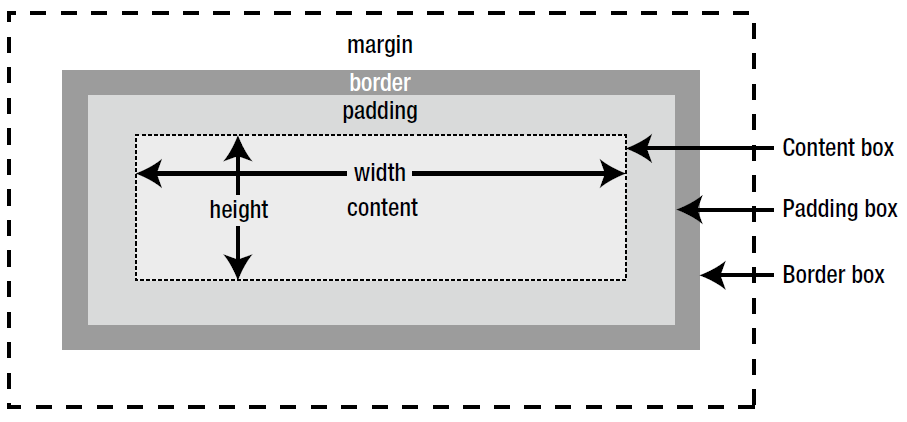
The CSS box model is essentially a box that wraps around HTML elements.The CSS box model consists of the following components:
Content This is the content of an HTML element, such as a paragraph, image, <div>, or <span>.
Padding Horizontal and vertical space surrounding the content.
Border A border drawn around the padding.
Margin Horizontal and vertical space outside the border.
If padding or borders are undeclared, they are either zero (if you are using a css reset) or the browser default value. Browsers apply default values to individual elements. For example, paragraphs have default top and bottom margins, but no padding or border, whereas <div> elements have no padding, border, or margins. You can use CSS to adjust the padding, border, and margins independently on each side of an element to control its look and layout.
Many people confuses the way in which width and height are calculated in modern browsers.
Let’s see it with an example:
Consider below style for div –
div {
    width: 100px;
    height: 50px;
    padding: 10px;
    border: 10px solid navy;
    margin: 5px;
}
Total box width = 100 + 20 + 20 + 10 = 150
And Height = 50 + 20 + 20 + 10 = 100
The total width of an element is calculated like this:
Total element width = width + left padding + right padding + left border + right border + left margin + right margin
The total height of an element is calculated like this:
Total element height = height + top padding + bottom padding + top border + bottom border + top margin + bottom margin
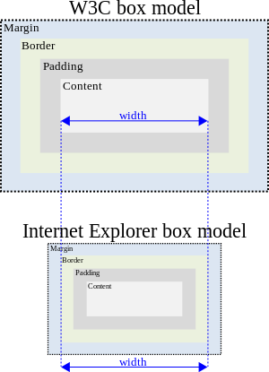
Please note that Internet Explorer 8 and earlier versions, include padding and border in the width property.
Source :https://en.wikipedia.org/wiki/Internet_Explorer_box_model_bug
Doctype Modes
In the old days of the web, pages were typically written for Microsoft Internet Explorer. When the web standards were made at W3C, browsers start using them, as doing so would break most existing sites on the web. To solve the incompatibility issue Browsers introduced two modes- Standard Mode and Quirk Mode.To fix the box model problem, use Standard mode.
all browsers needed two modes: quirks mode for the old rules, strict mode for the standard/
For HTML documents, browsers use a DOCTYPE in the beginning of the document to decide whether to handle it in quirks mode or standards mode. Make sure you put the DOCTYPE right at the beginning of your HTML document. Anything before the DOCTYPE, like a comment or an XML declaration will trigger quirks mode in Internet Explorer 9 and older.
In html5 you will have to just write <!DOCTYPE html>
Go to the next page to understand Padding, Margins and box sizing to control these- Click on the below red circle with page number.
Paddings and Margins
Both paddings and margins add vertical and horizontal space around elements. To see the difference between margin and padding consider below html and its output.
<!DOCTYPE HTML>
<html>
<head>
<style type="text/css">
body{
 background:  #FFFFE0;
}
.not-padded{
  width: 200px;
  border: 1px solid green;
  margin: 10px;
  background:  #FFFFFF;
}
.padded{
  width: 200px;
  padding: 20px;
  border: 1px solid green;
  margin: 10px;
  background: #FFFFFF;
}
</style>
</head>
  <body>
    <div class='not-padded'>
      div1{
          width: 200px;
          margin: 10px;
          border: 1px solid green;
          color: red;
          background:  #FFFFFF;
          }
    </div>
    <div class='padded'>
      div2{
          width: 200px;
          margin: 10px;
          border: 1px solid green;
          padding: 20px;
          background:  #FFFFFF;
          }
     </div>
  </body>
</html>
Save this page example.html and open in Chrome with developer console.
div without padding
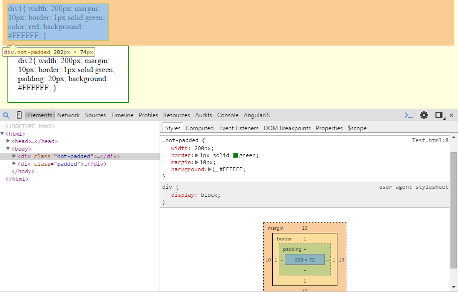
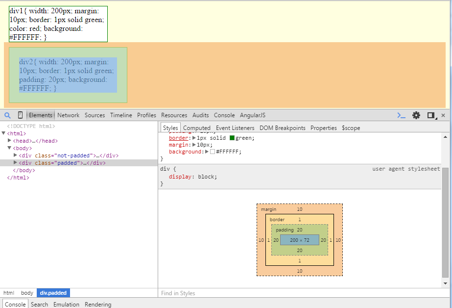
You can see that the content width is 200 which follow just inside border since padding is 0. Box width is 200 + 2(left+right border) + 20 (left and right margin) = 222
You can see that second div is 40 pixels greater than the first one because the left(20px) and right(20px) padding is added outside the content.
You can see that the content width is 200 and after that there is 20px padding then border comes. Box width is 200 + 40(left+right padding) + 2(left+right border) + 20 (left and right margin) = 262
Difference between padding and margin:
- The content’s background (div yellow background) stretches to padding while in margin cantent’s parent background shows through margin – in this case yellow background of body.
- padding – inside border, margin- outside border.
- padding never collapse, adjacent vertical margin collapse When block-level elements follow one another.
As you can see that box model is confuses many developers while calculating width and height. People always used to calculate width and height from one side border to other side border.In fact IE interpret the box model like this only. In all the modern browsers if you want to calculate width or height then you will have to add padding and border.
i.e Actual width or height = width or height + 2*padding + 2*border.
CSS3 offers a way by which if you want then an element width and height will not be affected by border and padding. To get this behavior you will have to specify
box-sizing: border-box
There are other values which you can specify to the box-sizing:
border-box – Width and height include content, padding, and borders.
padding-box(only supported in Firefox at the moment.) – Width and height include both content and padding.
content-box – Width and height apply only to the content box. This is the default.
To see the effect of box-sizing, consider below html –
<!DOCTYPE HTML>
<html>
<head>
<style type="text/css">
body{
 background:  #FFFFE0;
}
.contentbox{
  width: 200px;
  padding: 20px;
  border: 1px solid green;
  margin: 10px;
  background: #FFFFFF;
  box-sizing: content-box;
}
.borderbox{
  width: 200px;
  padding: 20px;
  border: 1px solid green;
  margin: 10px;
  background: #FFFFFF;
  box-sizing: border-box;
}
</style>
</head>
<body>
<div class='contentbox'>
div1{
  width: 200px;
  padding: 20px;
  border: 1px solid green;
  margin: 10px;
  background: #FFFFFF;
  box-sizing: content-box;
}
</div>
<div class='borderbox'>
div2{
  width: 200px;
  padding: 20px;
  border: 1px solid green;
  margin: 10px;
  background: #FFFFFF;
  box-sizing: border-box;
}
</div>

</body>
</html>
div with box-sizing: content-box;
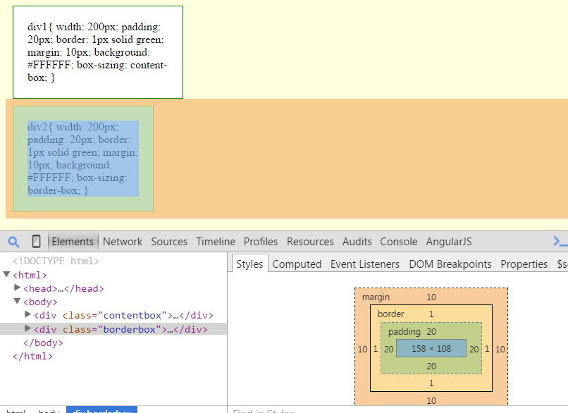
Here you can see that the content width is 200 because the width is not calculated after adding padding and border.
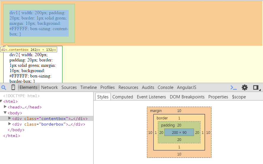
div with box-sizing: border-box;
Here you can see that content width is 158 because we have given box-size as border-box — means width 200 includes padding and border.
200 – 40 (left and right border) – 2 (left and right border) = 158
The box-sizing property is not supported by IE 6 and IE 7.
The box-sizing property is not inherited, so you can apply it to individual elements.
Alternatively, you can apply it to all elements using the universal selector like this:
* {
-moz-box-sizing: border-box;
-webkit-box-sizing: border-box;
box-sizing: border-box;
}
References
Beginning CSS3 – David Powers
https://en.wikipedia.org/wiki/Internet_Explorer_box_model_bug
https://css-tricks.com/the-css-box-model/
https://css-tricks.com/box-sizing/

